Table of Contents
When was the last time you hit “Accept” without reading a word? Probably today.
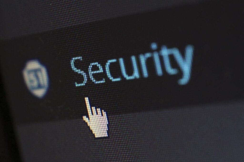
User experience is meant to be easy, but these days, ease isn’t enough. People want fast logins, sure—but only if their data stays safe. Today’s users expect honesty, control, and design that puts security first.
Trust isn’t a bonus anymore. It’s the main feature. Whether you’re buying shoes or checking lab results, the question is no longer “Is this simple?” It’s “Is this secure?”
In this blog, we will share how UX is being rewritten around trust, how security and design now work side by side, and why getting this right means survival in a breach-first world.
Breach Fatigue Changed the Game
For years, data breaches felt like rare disasters. Now they feel like Tuesday. Between global ransomware attacks, leaked customer lists, and banks accidentally tweeting out customer info (yes, that happened), people are tired. They’re suspicious. And they’re watching.
Trust used to be built with a clean interface and a clever tagline. Now, it starts with transparency. Who collects your data? What do they do with it? Is the “Sign in with Google” button really safer, or just easier?
Users have seen what happens when companies get it wrong. They don’t forget. One bad security headline can wreck a brand’s credibility for years.
So, what does this mean for UX?
It means designers can’t work in isolation. They need to understand how data flows, how breaches happen, and what real users fear. Security isn’t just a tech department issue anymore. It’s a design choice. It’s a layout choice. It’s a copywriting choice. And the people who can bridge those worlds are now in high demand.
Professionals pursuing a cybersecurity masters online are often at the center of these conversations. Their training goes beyond code and risk management. They’re learning how to communicate security principles in a way that’s both accurate and user-friendly – without stepping away from work. That skill set is becoming essential as more companies realize that good UX without good security is like a front door without a lock.
Why Clarity Is Now King
One of the biggest shifts in modern UX is language. Legal jargon used to hide in the shadows of terms and conditions. Now it’s under a spotlight.
Today’s users are demanding plain language. They want to know exactly what “We may share your data with third parties” means. Who are those third parties? Why do they need it? And how do they plan to protect it?
Designers are responding by creating layers of clarity. Tooltips, sidebars, short-form explainers. Instead of one 10,000-word legal document, smart platforms are using microcopy to walk users through risks and permissions.
Apps like Signal, ProtonMail, and even Apple’s newer privacy settings have been praised for showing, not hiding, the boundaries of user control. It’s not about scaring people. It’s about respecting them.
When users feel informed, they feel empowered. And empowered users stick around.
Security Flows Start at Onboarding
The first five minutes of a user’s experience set the tone. If the login process feels sketchy, rushed, or confusing, trust drops. Fast.
That’s why more companies are rethinking how they handle account creation. Multi-factor authentication (MFA) isn’t just a feature anymore. It’s a reassurance.
Designers are building flows that make MFA easy and natural. QR codes instead of long passwords. Biometric options that explain what data is stored and where. And most importantly, control. Users want to know they can opt out, reset, or double-check their own settings.
It’s also why companies are ditching the “one-login-for-all” model. Platforms that let users set granular permissions—what can be saved, what can be shared—earn more trust.
Think of it like a smart home. Would you rather have one giant on/off switch, or the ability to control lights room by room? In tech, users want the same flexibility.
Designing for Skepticism, Not Just Convenience
The new UX mindset is no longer “How can we remove all the friction?” but “Which friction builds confidence?”
Some hurdles are good. When a bank app asks you to verify your identity twice, it feels secure. When it never does, it feels shady.
Modern UX accepts that friction, if done right, can enhance trust. Confirmation screens. Activity alerts. Notifications about logins from new devices. These aren’t annoyances. They’re signs that someone’s paying attention.
Platforms like Slack and Notion have started including subtle security nudges—like reminders to review shared links or access settings—right inside their workflows. These small prompts send a big message: we’re watching out for you.
That kind of baked-in reassurance goes further than a flashy dashboard or minimalist design ever could.
What Happens When Trust Is Broken
When trust fails, it doesn’t just cost users. It costs time, reputation, and real money.
Think of the major breaches in the past few years—Facebook, Marriott, even government systems. In each case, users didn’t just feel betrayed. They were confused. No one told them clearly what had happened, what was exposed, or how to respond.
Modern UX has to plan for failure. What does a breach notification look like? How fast can users find out what data was affected? Can they revoke permissions with one click?
The post-breach user experience is a new frontier. And it’s where real loyalty is won or lost.
Some companies are learning this the hard way. Others are using it as a chance to lead. Dropbox, for example, now provides real-time activity logs and easy data export options. That kind of transparency builds credibility—even when something goes wrong.
Where UX and Cybersecurity Finally Shake Hands
We’re past the point where design and security are separate. Today’s best tech products are built with both in mind from the start.
The collaboration between UX teams and cybersecurity experts is no longer optional. It’s essential.
A beautiful app that leaks data is worthless. A secure system no one can navigate is useless. The future of tech belongs to those who can combine both.
And users are watching. They might not know the technical terms. But they know when something feels off. And in a world where tech is everywhere, that feeling matters more than ever.
So yes, trust is a feature now. But it’s not a badge you slap on after launch. It’s built screen by screen, prompt by prompt, click by click.
That’s the new UX rulebook. And it’s one worth following.