Table of Contents
Source: https://unsplash.com/photos/tZc3vjPCk-Q
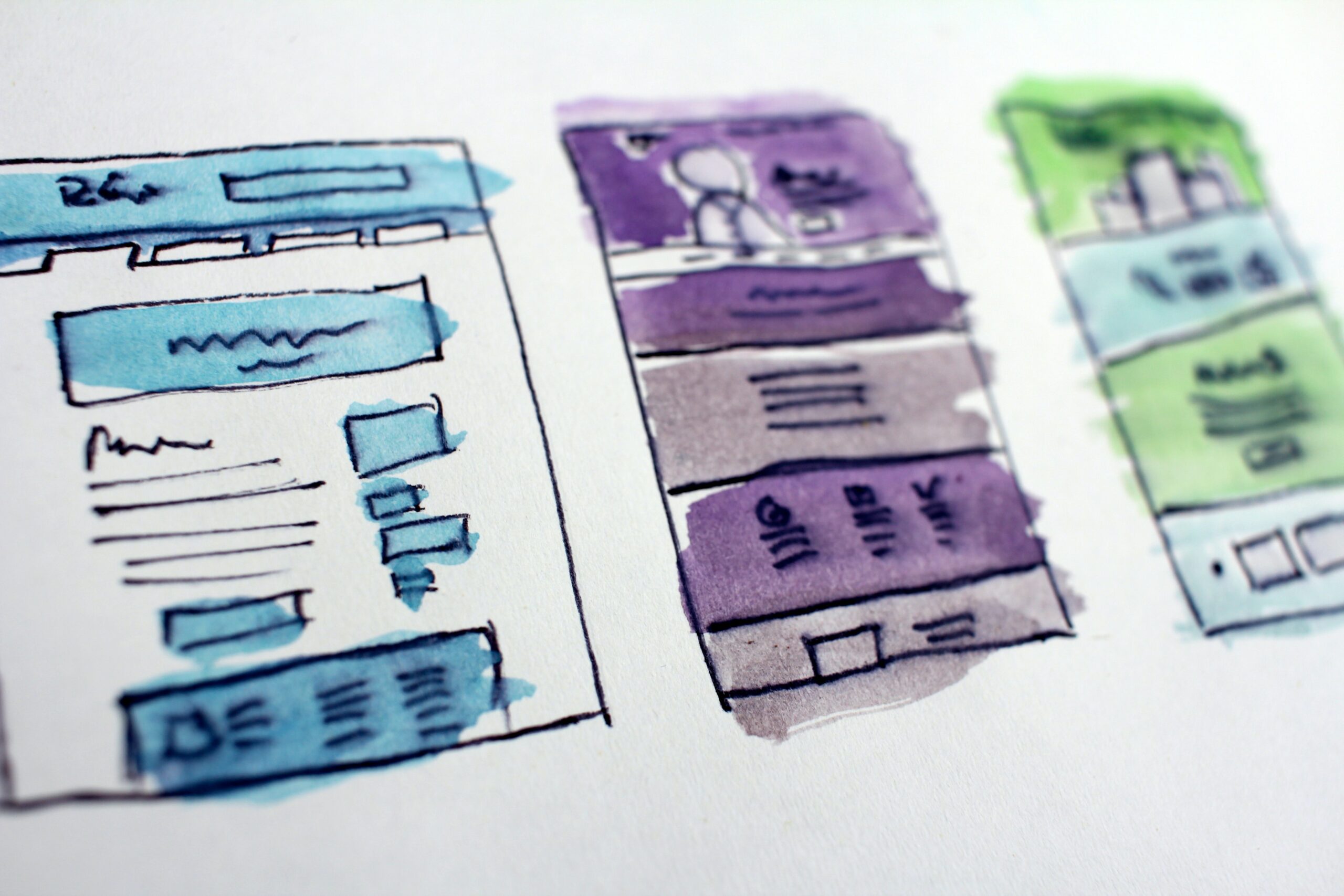
Web design trends come and go. What is popular today and recognizable by almost everyone can become yesterday’s news overnight. It’s essential to develop your own style and image that will speak for your startup or catch the eye of potential customers. Yet, there are some rules you should never break if you want your design to stand out.
Just like anything else, good design comes with practice. So, you should dedicate some time to practicing your design skills and developing your voice and vision. As a student, you might want to redistribute your homework workload between EssayPro.com and yourself as you get more hands-on experience. It includes a lot of research, looking for inspiration, and, of course, designing.
It is always easy to learn from the example of successful web pages. Yet, you also need to explore as many websites as possible to find good and bad designs. Walk in the user’s shoes and take notes on what makes your experience overwhelming. Design, test, investigate, and you will succeed in avoiding these mistakes that can cost you a client.
Heavy design that results in slow website loading
The key aspect to achieving success with your design is the website loading speed. If your design is overabundant with heavy elements and unnecessary widgets, you get clients that leave after waiting more than ten seconds. On average, people expect the website to load in two seconds, which also reflects that you should adjust your design to overall user expectations and experience.
Leave only essential elements that are a must for your website. Don’t overdo your draft, and try to fit everything you can on the main page. Learn more about how you can optimize the page and make your code as functional as possible. It is better to have a clear structure and more pages that your users can click on when visiting your webpage.
Use available tools to test how your webpage is doing in terms of speed. For instance, Google’s PageSpeed Insights can help you to understand your page performance. Then optimize your design and its content to make it load fast and perform correctly.
Not understanding and not testing UX
Always run multiple tests and take an outsider’s perspective on your design. Try to find all bugs, inconsistencies, errors, and bad performance across devices before your clients will do it for you (and never come back). When looking at UX and testing it, consider answering the following questions:
- Is the webpage navigation clear and helpful for users?
- Do calls-to-action (CTAs) guide your users?
- Do colors, icons, and images create a solid impression?
- Is the information (links, content, and other info) relevant and updated?
- Is your website safe and secure for your clients?
User experience defines whether someone will stay on your page and continue exploring and reading more about whatever it is you present. Always ensure that your design is not just appealing but also functional.
Your design is ‘too much’
You might be a revolutionary genius in the web design world, but you won’t make it far if you oversee basic readability. When you attend web design courses, you might want to use all tools available for you to create a perfect webpage. Yet, a perfect design is consistent, it allows your clients to feel comfortable and confident when visiting the page.
Don’t try to put everything you want in one layout, as it may leave an impression of ‘tacky’ and cluttered site. Not all design choices work well together, and some choices should be left in the past. Make sure all buttons, icons, images, and colors work harmoniously. It’s good to experiment in drafts before implementing the design into the final version.
Your design is ‘too simple’
The vice opposite of abundance is tasteless simplicity. Many people leave websites because they give them little to no information when they spend the first several minutes on the main page. Even if you opt for a simple design, make it stylish and memorable.
Minimalism may be an unconscious choice when creating your first copy, but it has to have a soul to avoid being perceived as simple. Try to find the middle ground of providing just enough design elements that will be appreciated by your clients and reflect your ideas. The last thing you want is to avoid getting compared to endless designs that can be created by website builders.
Ads that get your clients to run away
Many sites make money by placing ads on their pages. And if you choose to do so, you need to be careful with their amount and contents. Too much advertisement can overwhelm your visitors and create a sense of an untrustworthy resource they want to close immediately.
At the same time, plan to incorporate ads organically in your original draft. If you don’t plan it beforehand, you create more problems for yourself in the future. Therefore, plan your structure, leaving space for some ads or other informative blocks relevant to your page.
Mobile and tablet unfriendliness
Expect your users to find your website from their smartphones, tablets, and other devices. Always adapt your design to different devices, and you will win your clients’ hearts with its availability. At the same time, look into opportunities to develop an independent app for your business, but it might be a plan for the future. The more options you give and count on users’ needs, the more likely they will stick around.
You underestimate the power of SEO
Even though it is not directly linked to a design per se, SEO plays a crucial role in your website visibility when users search for a specific product or service. Search engine optimization, or SEO, helps bring traffic to your page. It relies on high-quality content, keywords, and other strategies to make it stand out among other sites.
Never neglect other components that make your website thrive. Try learning more about SEO strategies and create a plan that gives your website a breath of life. Envision how your content will look in the overall design and make everything possible to deliver an excellent interface and meaningful content. Significantly, ensure that your content is of the best quality and not gibberish that takes up space.
Your website is not inclusive
You need to bear in mind different groups of people if you want to make it in the world of web design. Your webpage should be accessible for people with disabilities or provide an adapted version for them to use. Not including others can cost you reputation because effort always speaks louder than your words.
Consider these aspects when researching accessibility:
- Use tools like Accessibility Insights.
- Let your clients leave their feedback easily.
- Include alt text.
- Choose high-color contrasts.
- Set easy-to-read fonts and font sizes or allow users to change them.
- Test whether your website is accessible to assistive tech.
The bottom line
Don’t be afraid to create a disastrous first draft that will scream at you from the screen. Make mistakes and save them in your Figma drafts, revisit them, and learn from your own experience. Once again, practice sharpens your skills and makes you a better professional. What’s important is to set goals you want to achieve and continuously work on accomplishing them.