Table of Contents
Apple’s Big Reveal: What Is Liquid Glass?
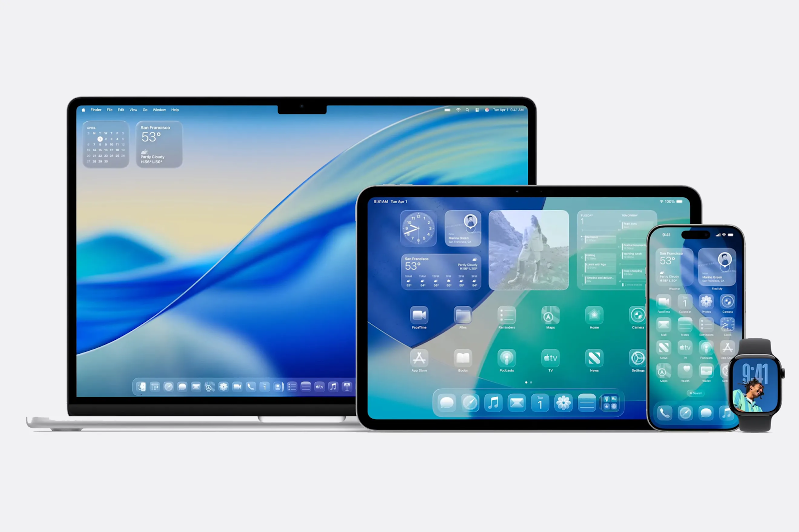
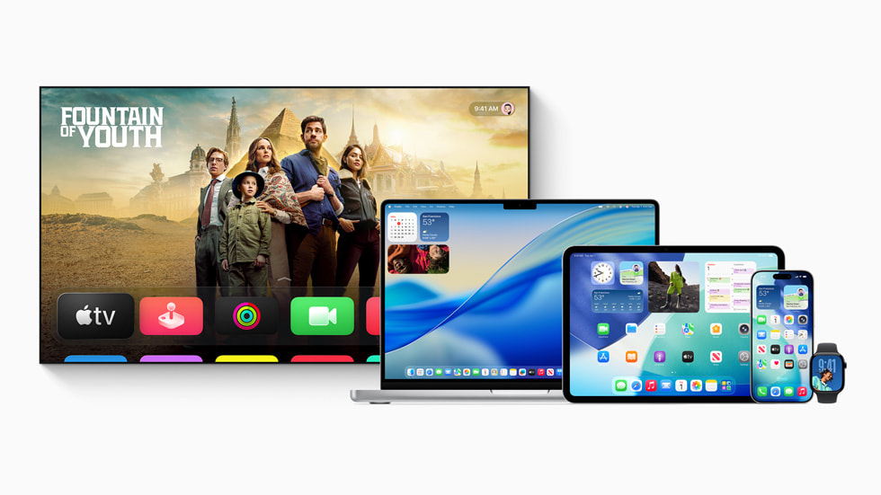
Apple At WWDC 2025, Apple revealed its new “Liquid Glass” design language, across iOS 26, iPadOS 26, macOS Tahoe 26, watchOS 26, and tvOS 26.
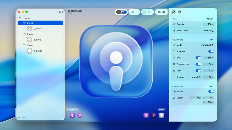
Apple describes Liquid Glass as a “delightful and elegant” software design, crafted to make apps and system experiences more expressive, dynamic, and visually unified across all Apple devices. But the major core idea? Translucent layers, floating elements, and a sense of depth inspired by the spatial computing interface of the Vision Pro headset
According to Apple, Liquid Glass isn’t just about looks. The company claims it’s a “new digital meta-material” that adapts to its surroundings, reflecting and refracting content while dynamically transforming based on it.
This is supposed to bring greater focus to your content, make controls feel more alive, and create a sense of harmony between hardware and software.
But behind the marketing and all the flashy ads, what does this really mean for us? Is this a big jump upwards or a downfall to the trenches
Vision Pro Roots: When Spatial Design Meets Flat Screens
Liquid Glass is a copy of the design language which was first seen in Apple’s Vision Pro headset. In that device, the floating, translucent layers made sense: the headset aimed to blend digital content with the real world, creating a sense of spatial presence and in real real-world experience.
On Vision Pro, these effects helped digital windows feel like part of your environment.
But most Apple devices, iPhones, iPads, and Macs are just screens.
They don’t mix digital content with reality. On these devices, the see-through effects and 3D illusions are just for decorations and they dont add much to the user experience.
Buttons shimmer, menus expand with spatial continuity, and navigation tools float above your content. Apple says this creates “a new level of vitality,” but in reality, it is not a big update or a great innovation. It is just a gimmick
The new design does bring some genuine refinements. Menus now expand from the point you tap, creating a subtle sense of continuity. Controls are grouped more thoughtfully, and inactive elements are softened with blur and translucency, which can help guide your attention. But these are incremental improvements nice touches, not a big or a important industry breakthroughs.
The Reaction: Polished, Pretty, and… Familiar?
Apple’s Liquid Glass rollout has sparked intense debate among fans and critics. Many users immediately compared it to Windows Vista’s Aero interface, which also introduced translucent layers and glassy effects nearly two decades ago.
While Aero was initially praised for its futuristic look, it was later criticized for being resource-intensive and sometimes distracting.
Online, the mood has been mixed. Some celebrate the new look as Apple’s boldest visual revamp since iOS 7, while others argue it breaks from the company’s signature minimalist style in favour of something flashier but less purposeful.
Memes and jokes about Steve Jobs “firing everyone” at Apple quickly spread, highlighting the sense that this update is more about appearance than substance.
“We used to have standards and taste,” one user quipped, echoing a broader sentiment that Apple’s design engine isn’t firing on all cylinders.
Even Apple’s own design chief called Liquid Glass the “broadest” update ever not the boldest, not the smartest, just the most widespread.
That choice of words says a lot: this is about unifying Apple’s ecosystem, not redefining it.
Has Apple Lost Its Edge?
For years, Apple was known for bold, industry-defining design moves. The original iPhone, the iMac, even the shift to flat design with iOS 7, these were moments that changed the way people thought about technology.
With Liquid Glass, Apple seems more focused on creating a consistent, polished experience across its devices than on taking risks or pushing boundaries.
There’s no doubt that Liquid Glass is visually decent.
The translucency, depth, and dynamic effects are executed with Apple’s usual attention to detail. But for longtime users, it feels like Apple is playing it safe.
They are adding extra details to the things that already existed, not a big changes.
Some defenders argue that this is a strategic move, laying the groundwork for a future where spatial computing and digital-physical blending are the norm. Liquid Glass could be the first step toward interfaces that truly bridge the gap between screens and reality.
But in reality it looks like adding flashy sticker and light to an old vehicle to make it look modern but under the hood it is still the same
The Verdict: Shiny, Safe, and a Little Bit Forgettable
Liquid Glass is Apple’s most ambitious visual update in years, but it’s not the revolution some hoped for. It brings polish, consistency, and a sense of modernity, but it doesn’t fundamentally change how you use your device or what it can do.
The daring innovation that defined the Steve Jobs era.
Apple’s new design language is beautiful, but beauty alone isn’t enough to recapture the magic of the past. For now, Liquid Glass is a reminder that even the world’s most celebrated innovators sometimes settle for a fresh coat of paint when what we really want is something that makes us dream again.