Icons are everywhere. Download one of thousands of free vector icon kits from the Internet™️ and start throwing pixels in the shape of hamburgers, kebabs and magnifying glasses over your artboards and you’ve got yourself a design. But have you stopped to think when to use an icon, and when not to use one? When to use which icon?
This piece shares some musing, and some research, from the SEEK UX team regarding iconography, which hopefully makes you more aware of the UX complexities behind these little 8-bit pieces of art.
Icons as static elements
Static icons are those used as decorative elements, to communicate a discrete piece of information or to help with way finding. Like everything, they can be both good and bad.
Icons are good
Well designed, and easily recognisable, icons can quickly communicate information a user may be scanning for — for example, scanning a page of search results for hotels that have WiFi, or the number of bedrooms in a property. We see this in symbolism for accessible car parks, signs for bathrooms and the universal symbol for poison.
![]()
Icons save space, and reduce cognitive load by removing the need to re-read the same piece of information against every listing, reducing friction.
Icons can also help with navigation for people who speak (or read) the language of the interface as a non-primary language (or not at all). I might not be able to read the text on the interface, but icons can give me an understanding of how to navigate around, or how to find what I’m looking for. This is also true in the real world and is why we have standardised icons for bathrooms, airports, elevators etc.
![]()
Icons are bad
Badly designed icons can add confusion when we don’t know what they are trying to represent to us, especially when they are not accompanied with text or a tool tip.

Icons for icons sake provide little value and add noise to the interface.

Icons without alt-text, are confusing for screen reader users. Particularly if it just reads out something like ‘Star’ instead of ‘Save Job’. Text labels help reduce this confusion for sighted users too.
Icons are subjective. The same icon can mean different things on different websites (e.g. a star for ‘saving’ and a star for ‘rating’). The same icon can mean different things in different contexts (e.g. an arrow for share, reply, forward, next). Icons can be indecipherable.

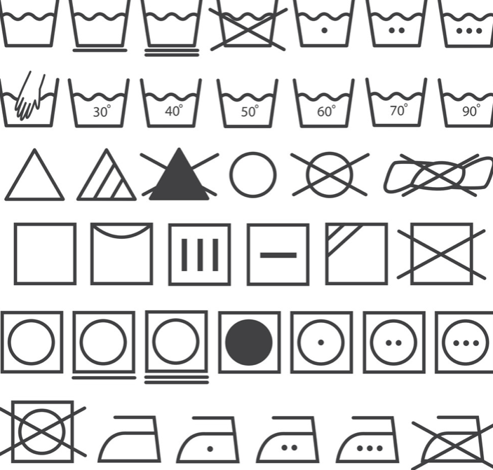
What do all the different laundry icons even mean?
Icons are bad
Badly designed icons can add confusion when we don’t know what they are trying to represent to us, especially when they are not accompanied with text or a tool tip.

Icons for icons sake provide little value and add noise to the interface.

Icons without alt-text, are confusing for screen reader users. Particularly if it just reads out something like ‘Star’ instead of ‘Save Job’. Text labels help reduce this confusion for sighted users too.
Icons are subjective. The same icon can mean different things on different websites (e.g. a star for ‘saving’ and a star for ‘rating’). The same icon can mean different things in different contexts (e.g. an arrow for share, reply, forward, next). Icons can be indecipherable.

What do all the different laundry icons even mean?
Icons as interactive elements
Seen an item you want to easily find again on an app or website? Just hit the handy dandy ‘save’ icon! But what, exactly, is a save icon?
Which icon, when?
It used to be an icon of a disk in the age of skeuomorphism — where an object in software was represented with its real world counterpart, in this instance a floppy diskette 💾. The floppy disk never got an upgrade as we moved from disks to CDs to USBs and to the cloud, but its meaning is still known. You’ve probably heard the folklore story of the child who said “Wow, someone 3-D printed the Save Icon!” upon seeing a 3 1/2 inch floppy disk IRL.
You’ll still see this in Microsoft Office products today.
